Pink is the soul of Valentine’s Day. It’s on every advertisement, every gift, every card, and basically every symbol of the lovey-dovey holiday. From a design and artistic standpoint, pink is the color of love, admiration, and affection. It’s created by blending red, the color of passion and love, and white, the color of purity and hope. But with all the different shades of the color, what shade of pink is the most Valentine’s-y?
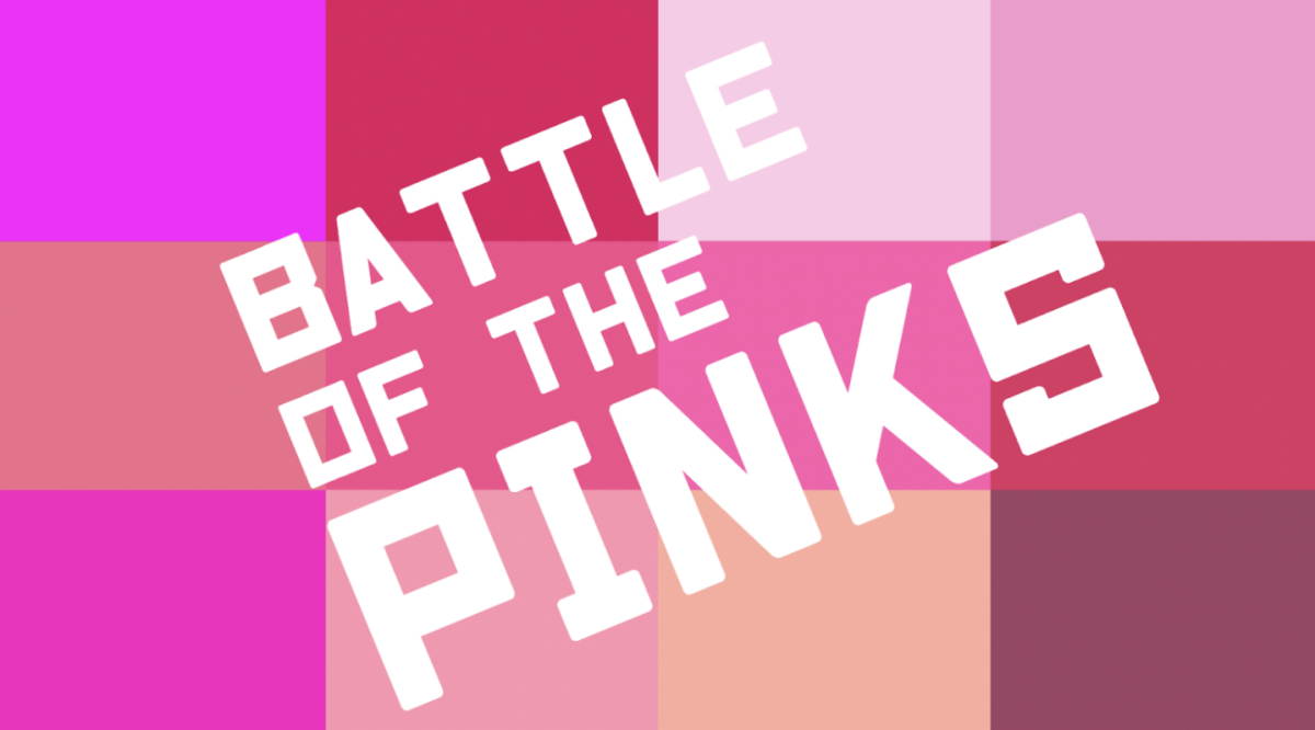
After digging through a sea of pinks, we collected twelve shades that are most commonly seen on Valentine’s day for battle. Our criteria: The color should be fluttery and light, like the butterflies people get in their stomachs when around their crush, but also passionate and vibrant (this is a holiday for celebrating love!). Love makes people feel warm and safe, but it’s also exciting, uncertain, and different for everyone! The color should reflect these factors with their undertones (cool or warm), values, and saturation.
The Reaping
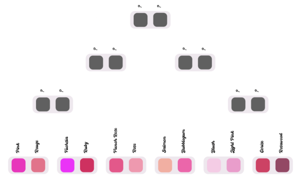
We’re featuring twelve diverse shades of pink with various rounds of competition to sift through the colors until we find the most Valentine’s-y pink. We have Pink (#fc0fc0), Rouge (#f26b8a), Fuchsia (#ff00ff), Ruby (#e0115f), French Rose (#f64a8a), Rose (#fc94af), Salmon (#fdab9f), Bubblegum (#fe5bac), Blush (#fccae7), Light Pink (#f699cd), Cerise (#de3163), and Rosewood (#9e4265). Who will survive and who will be eliminated? Let’s find out!
Round 1: The Beginning
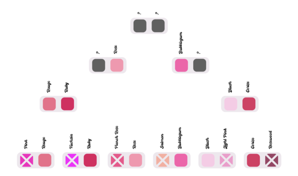
The colors eliminated in the first round were Pink, Fuchsia, French Rose, Salmon, Light Pink, and Rosewood. You may be wondering, ‘How could Pink lose in a competition about the color pink?’ Well, compared to Rouge, this shade of pink is too cool-toned and saturated to qualify as Valentine’s-y. This shade and Fuchsia make me think of the girl’s toy aisle in Toys R Us in the early 2010s. And not in a good way. More of a my-eyes-are-bleeding-pink way. Deciding whether to eliminate French Rose or Rose was more difficult. Both have warm undertones, but French Rose was ultimately disqualified for its darker shade and Rose looked more ‘fluttery’ and ‘flowery’ for its lighter hue. Rosewood was eliminated for its dark hues and cool tone, which gave it a muted and tired look, and Salmon was eliminated for being more orange compared to other colors.
Round 2: The Second Battle
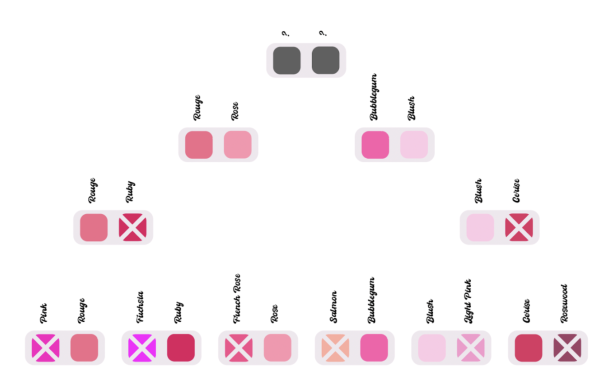
In the second round the number of our colors has dwindled to a mere eight. To prolong the suffering and extend this entertaining battle, we’re splitting the survivors up and pitting the first four colors against each other. Though Ruby and Cerise are definitely Valentine’s colors, their deep and rich shades seemed far too ‘passionate’ for a holiday as short as Valentine’s Day. Rich and dark colors represent wealth, which is why this color can be seen in velvety roses, expensive makeup, and pricey jewels, but completely lack the bubbly and innocent affection of Valentine’s Day. Next, Rouge and Blush will compete against Bubblegum and Rose.
Round 3: The Dawn
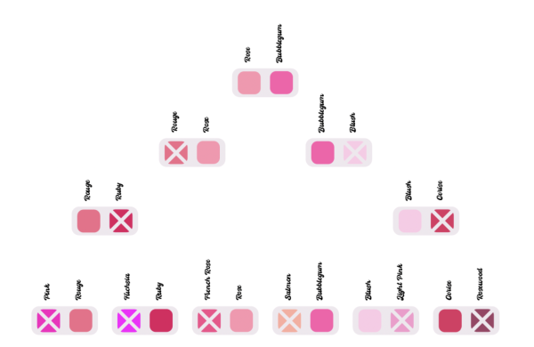
The end is approaching and the colors moving on are Rose and Bubblegum, leaving Rouge and Blush to rot. Rouge was eliminated for being darker and having a slightly muted red tint. Standing next to the fresh and more cheerful-looking Rose, Rouge looked like a soggy wilting rose petal that was left in old water for too long. As for Blush, although it has done very well up until now, it fails to surpass Bubblegum’s vibrance. Standing beside Bubblegum, Blush looks like it was locked in a basement with no access to sunlight, warmth, love, fresh air, or Vitamin-D.
Round 4: The Grand Finale
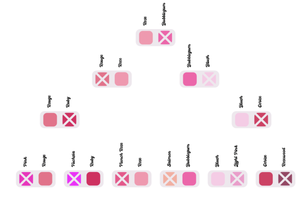
This choice was quite difficult, but good old #fc94af, aka Rose, has won its place as the most Valentine’s-y pink! Bubblegum was nice, but after much thought and consideration we realized it was the same color you’d see on cheap candy and products with those poorly glued plastic jewels that fall off at the slightest touch. On the other hand, Rose has the flowery name, the equally saturated and soft color, the cozy undertones, and the shade of natural blush. It’s the very definition of Valentine’s Day!
Now you’re probably thinking, ‘What in the world am I supposed to do with this information?’ Well, after spending hours, days, years, and millenia debating, searching, sifting, and finding all of this for you, the answer is…nothing. Color is art. And art is subjective. And to be an artist is to create something you find value in, sacrificing your blood, tears, and soul for a dream.
And we used that creative power for this. Thank you and you’re welcome!


